 :
:  :
:  :
:  :
:  :
: 


Expected Changes in Web Development and Design World for 2016!
.png)
World has drastically changed with the great utilization of smart gadgets and emerging updates by Google, to cater the needs of mobile surfers! In this smart phone scenario you cannot survive with old web designs even though very well designed. The importance of mobile friendly or small device search by search engines has awakened web developers and designers to think beyond box.
Response Oriented Websites
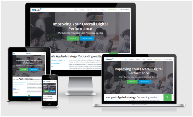
Mobile friendliness is a major challenge for all web designers. The web design must be in alignment with mobiles or tablets kind of devices. Your website needs to be in reflex action state with mobiles, Apple watch, Google Glass and rest of new gadgets. It must acquire the style and design as per display. The page loading time must be reduced and display well on all type of screens and equipments.
One Page Designs are Need of Time
One page designs for website is highly recommendable not only for 2016 but also future developments. You see that screen variations are in full bloom and users want to see the best results of website on whatever device they are using. People feel exhausted and intolerant for page loading time that conventional websites take up. So, one page design will be the focus of web designers in a way. Especially if we look at the online shopping trends then customers want to have a quick look at menu and the product pages. So, leading speed of pages will be a major factor of user stay and attraction as well.
Motion User Interface

Motion UI is one o the basic foundations for App functionalities by Google. The animations and transitions are less complicated and more diversified results are seen. Motion User Interface make it much easier for different people to move on the apps in a smooth and less complicate way. Here it is far easier to integrate the apps with Sass Mixins and CSS animations to rotate and to display with full functionality while surfing for different web pages.
Context Based Designs will Be Here
.jpg)
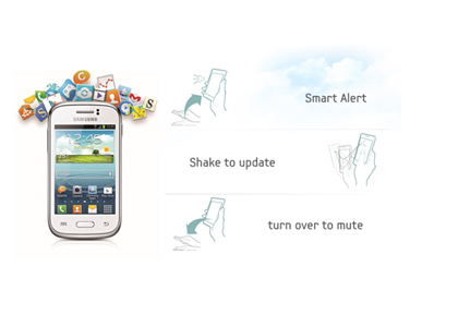
Now we see a variation in operational systems every single day. Now the users want to have visual and contextual treat while surfing through smart phones. So there is a difference in web designer and developer’s approach for sure. Now they keep on switching to variant operating systems. With SEO perspective it is highly recommendable to use a design scheme that is equally fit for all sorts of operating systems. Here the context of website is more appropriate to look for developing a real user interactive website and pages.
Side Bars and Pop-ups will be out!
The conventional method of focusing on side bars as must scene has already been changed with Google’s focus on website’s mobile friendliness. Now the emphasis is on main page content and imaged or small videos that are related with main context. You see the side bars are shown as horizontal with one page designs. Here it is more likely to be practical that popup scene would be no more in fashion and users will be relieved of it for sure.
Concluding Remarks
Though the expected challenges that web designers and developers will face in 2016 will be enormous! But it will be their creative as well as learning curve that they will surly enjoy. Besides the fast paced changes in technology makes it not a hard and fast rule that you will see the same case scenario at the end of 2016. There might be new horizon and new sets of challenges for web developers and designers as well.
 USA
USA UK
UK Canada
 Dubai, UAE

Hi
It's really very helpful article...
Thanks a lot for this great article and i think it would be a help me
a lot so keep posting,and i am always waiting for your article.